
Menovation
ClIENT: Identity Design
ROLE: Ashley Nowe
Sarah Jutras
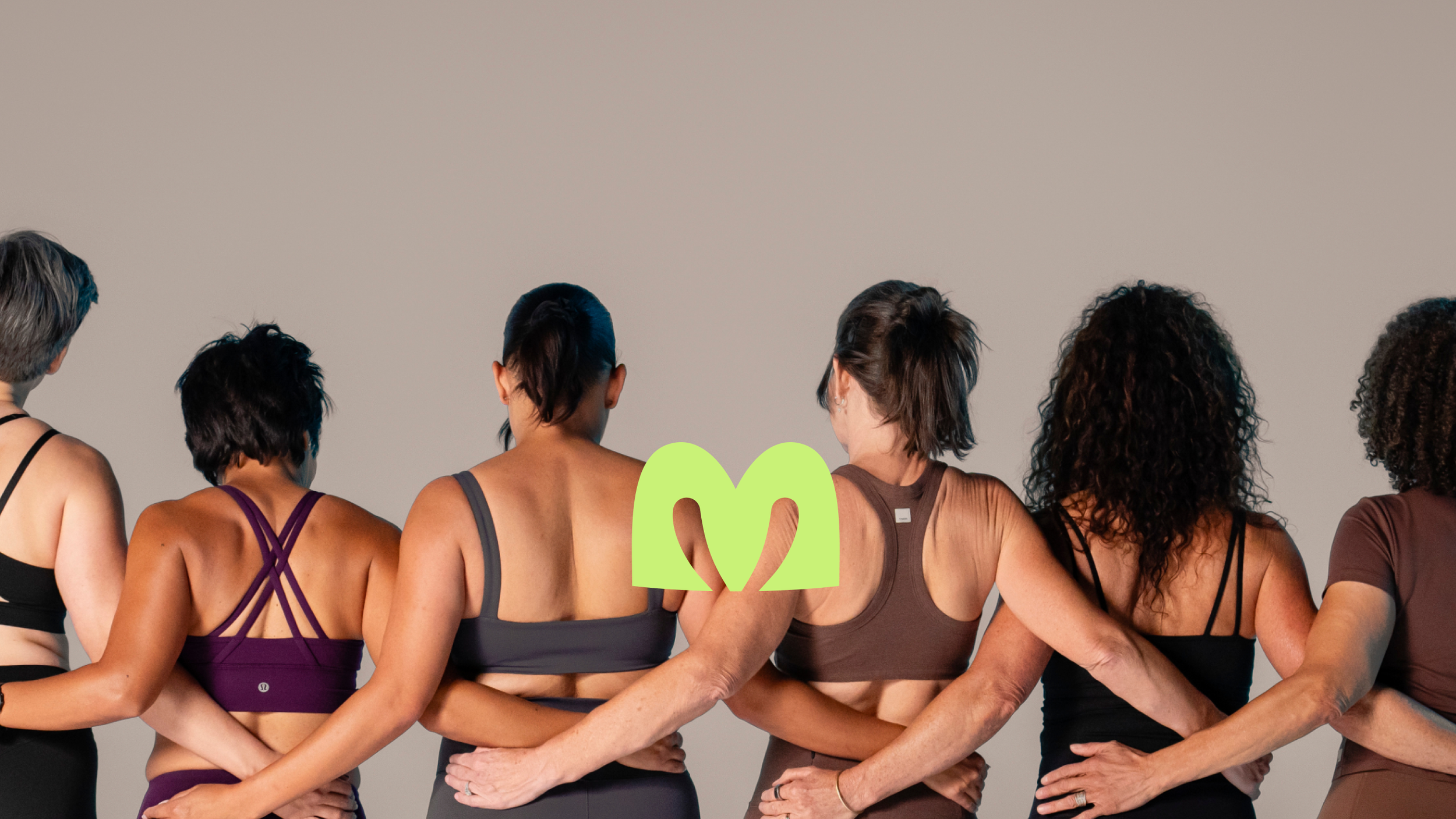
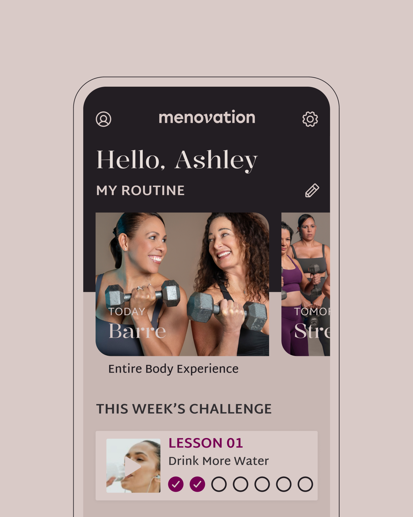
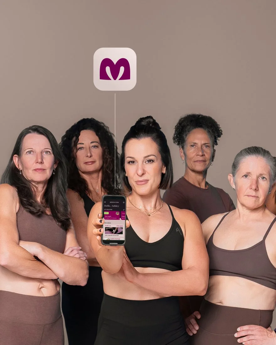
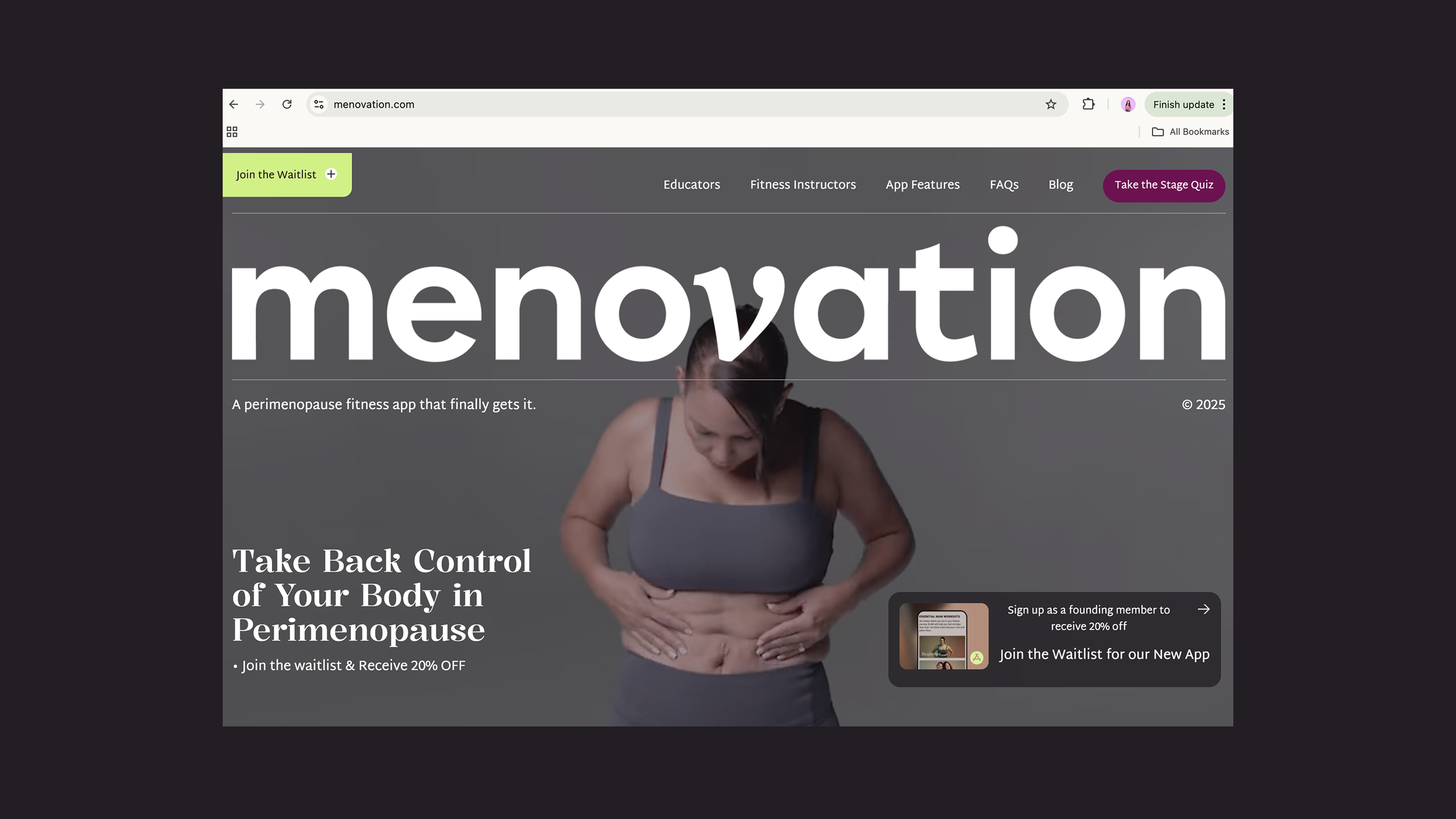
TEAM: Menovation is a health and fitness app designed to help women get strong and learn about their bodies during (peri)menopause and beyond. Ashley, the founder, deeply understands the challenges women face, offering evidence-based fitness programs, symptom tracking, and community backing. To support this significant life transition, she needed a brand identity that is personal, simple, yet distinct.
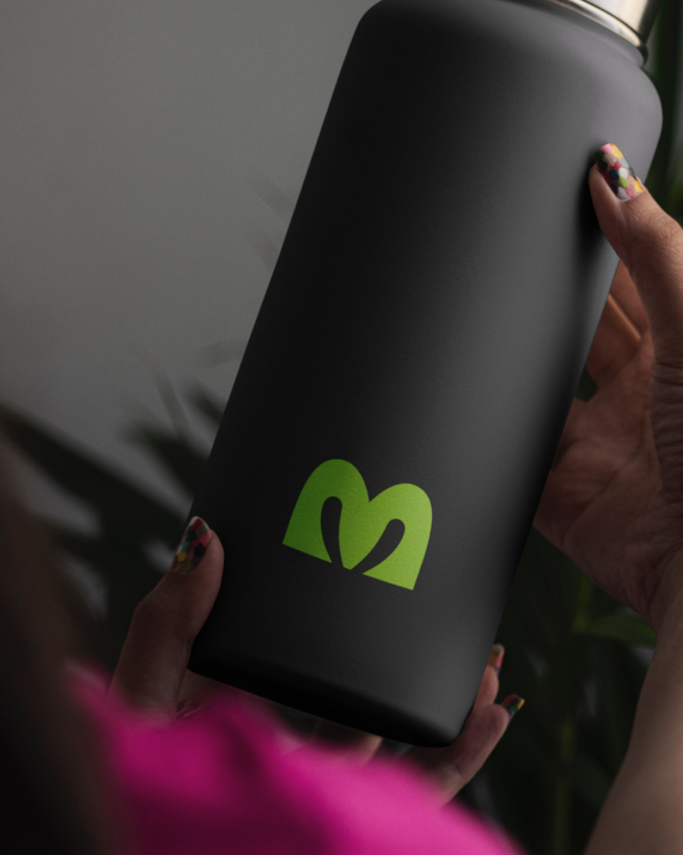
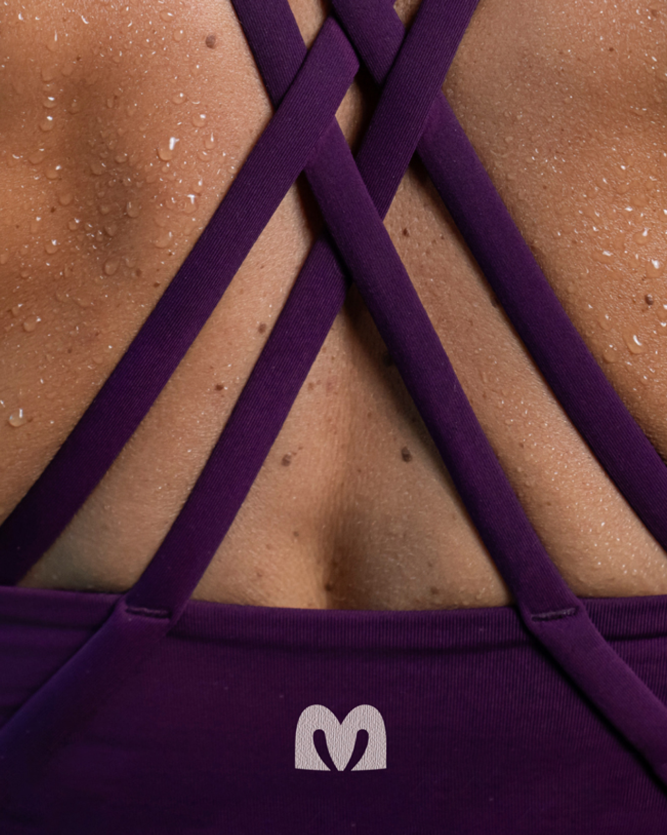
The identity (wordmark and symbol) stands for empowered strength, divine femininity, and independence, complementing the brand’s visual system and app experience.
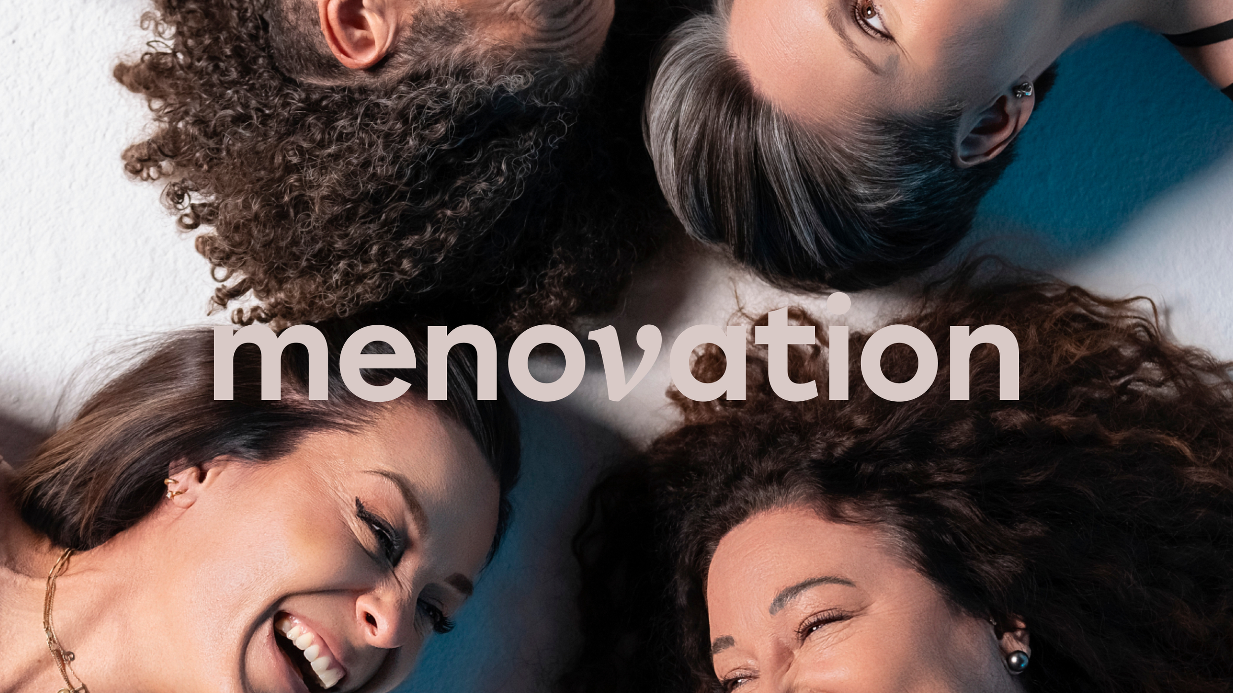

The brand is all about embodying fearless “queen” energy. The symbol references crown shapes, the letter M, and the reproductive system. It has a sturdy, symmetrical form with a V shape within the counters of the “M” to nod back to the italicized “V” in Menovation—designed as a word stress for pronunciation.
Strength and care can exist in the same form—structured and powerful, yet deeply connected to the body.
Menovation launched in August 2025 and has built a stronger, diverse virtual community, now with a 4.9 app rating. The identity continues to serve as a visual anchor for her growing, trusted community.
Keep exploring
Unbroken RTF
Branding, Packaging + Campaign
Freelance for Life
Branding
The Footwear Collective
Brand Identity