
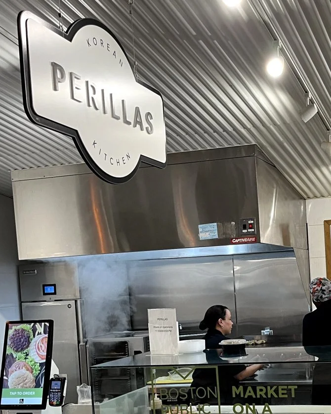
Perillas Korean Kitchen
ClIENT: Brand Identity + Signage
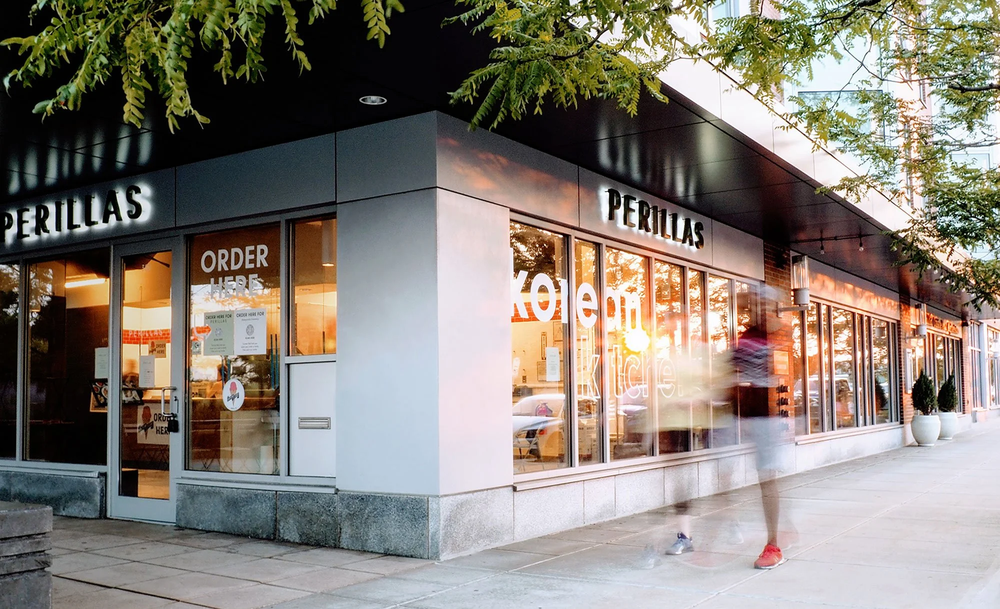
ROLE: Perillas is a fast-casual Korean kitchen in Boston, founded by James Choi, focused on making authentic Korean food more accessible through convenience and affordability. Ahead of opening its second location, the brand underwent a refresh to reflect its growth, new space, and evolving menu.
The visual system translated the brand’s values and attributes into a cohesive storefront experience, bringing clarity and consistency to the new location.
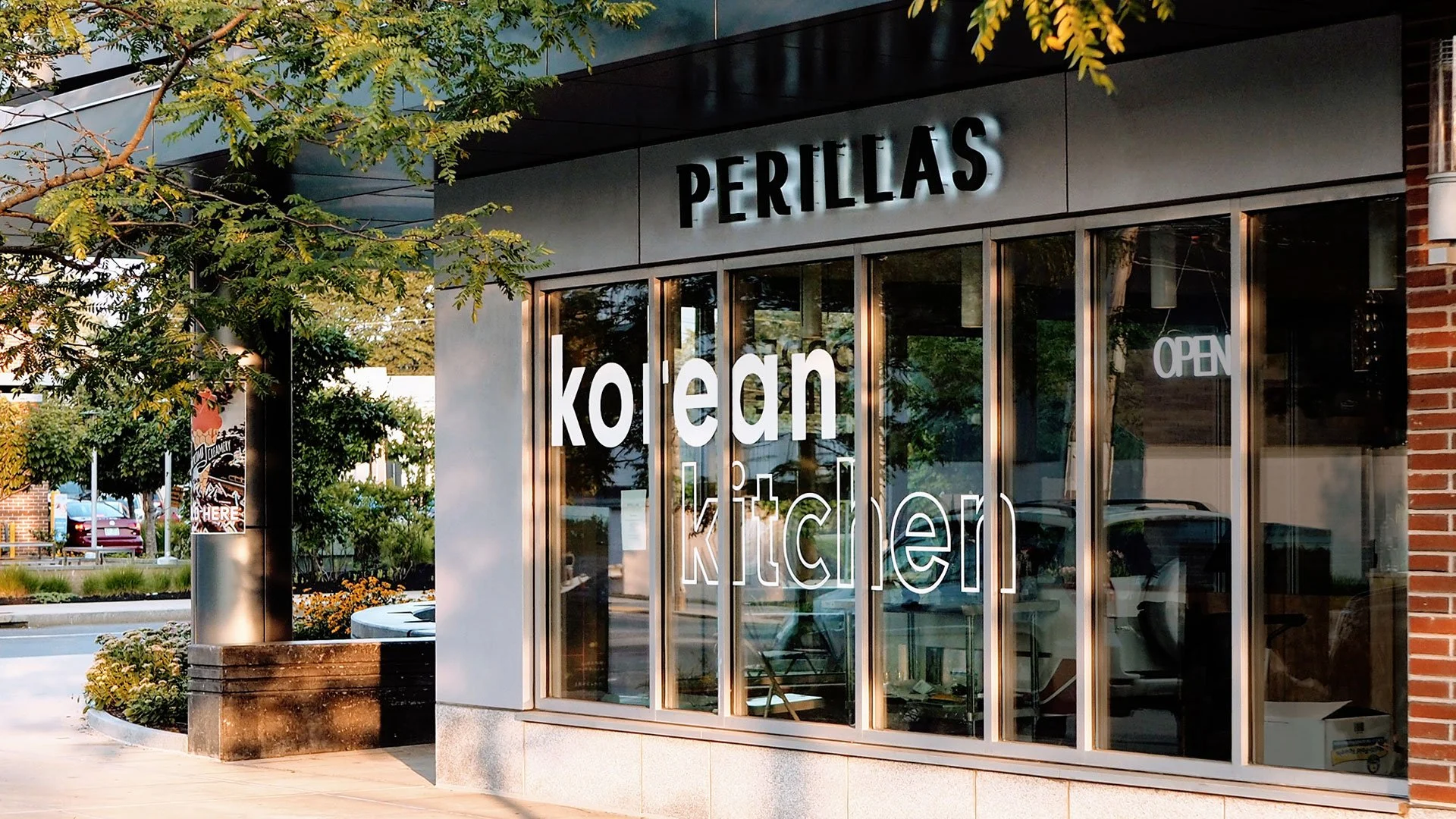
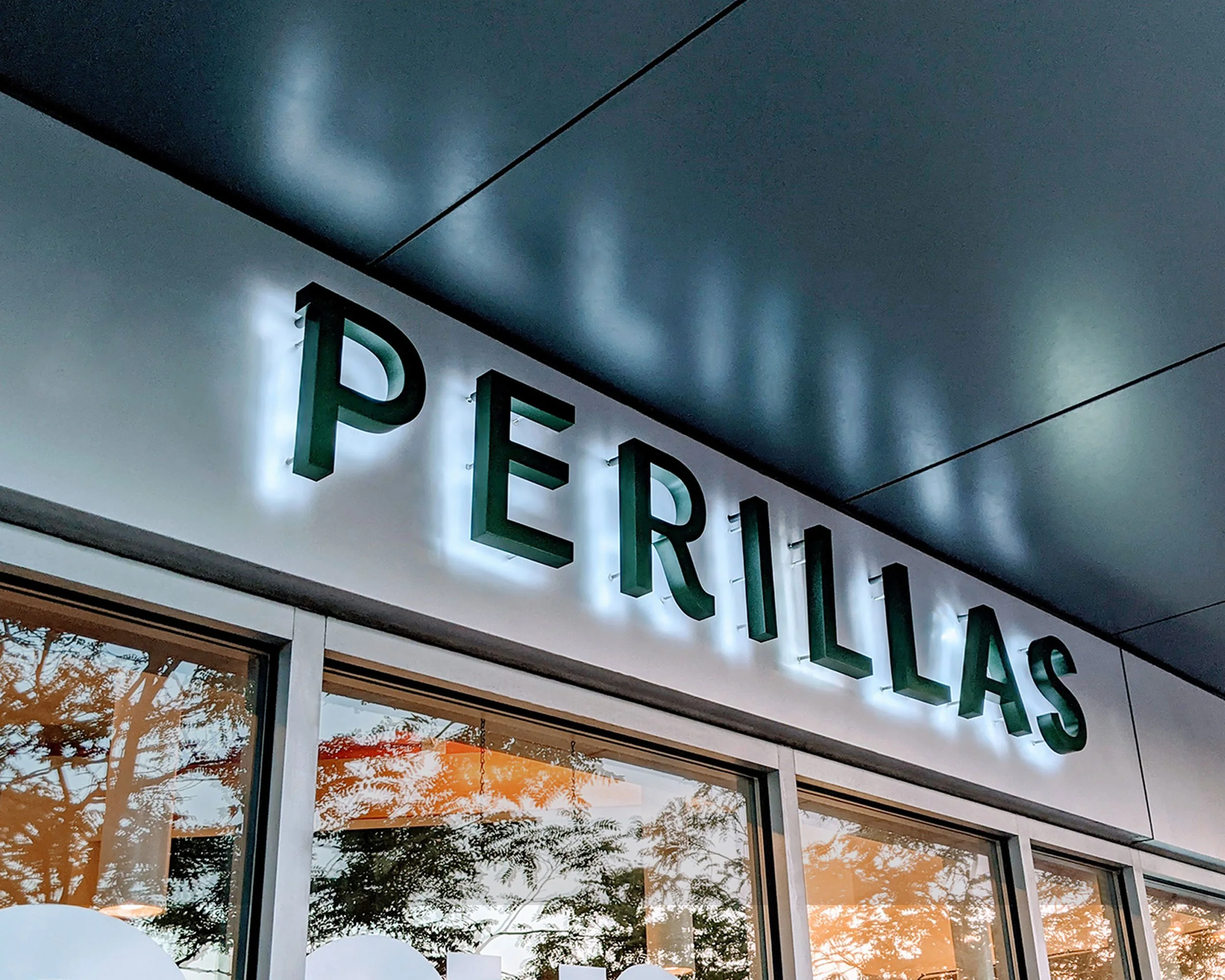
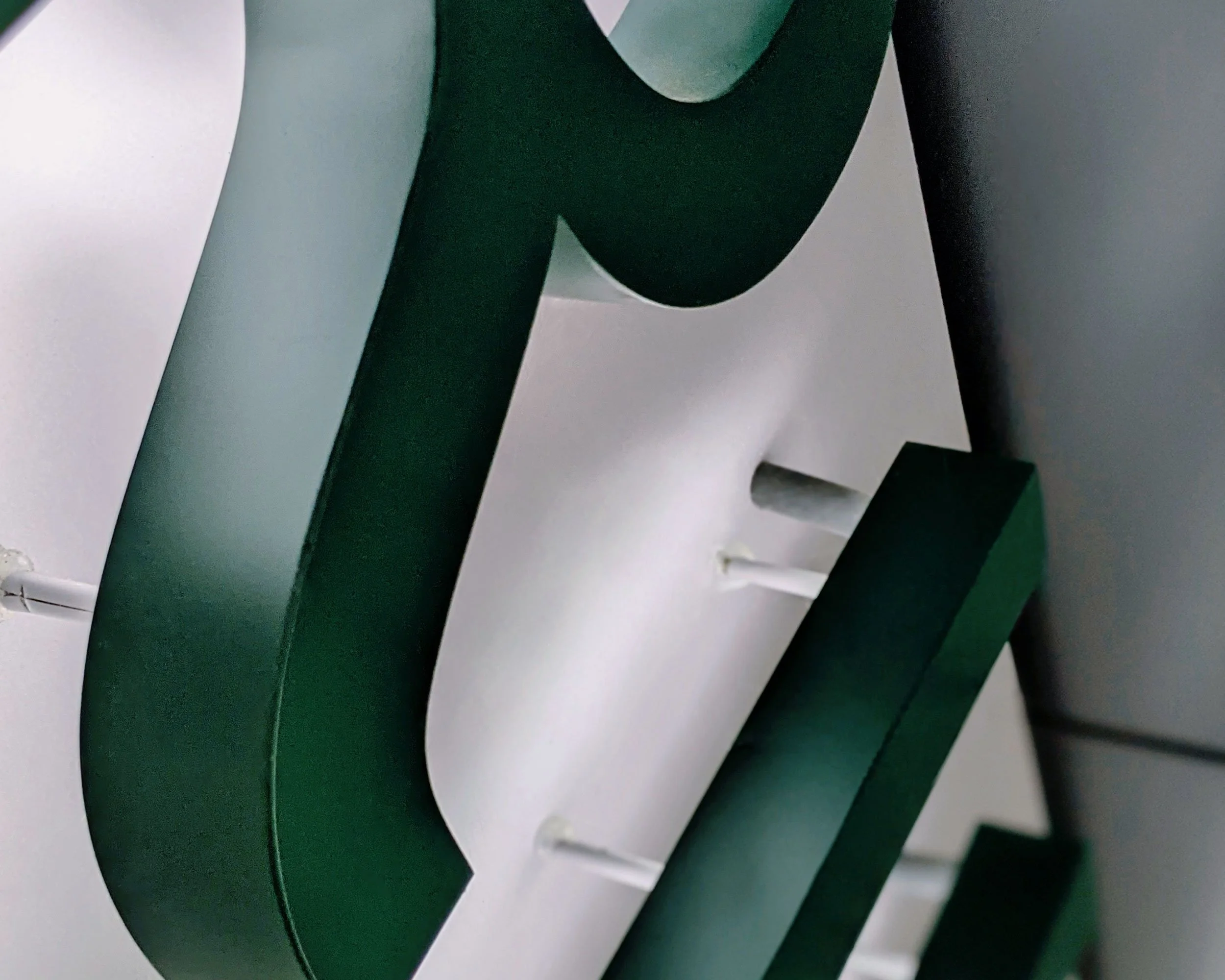
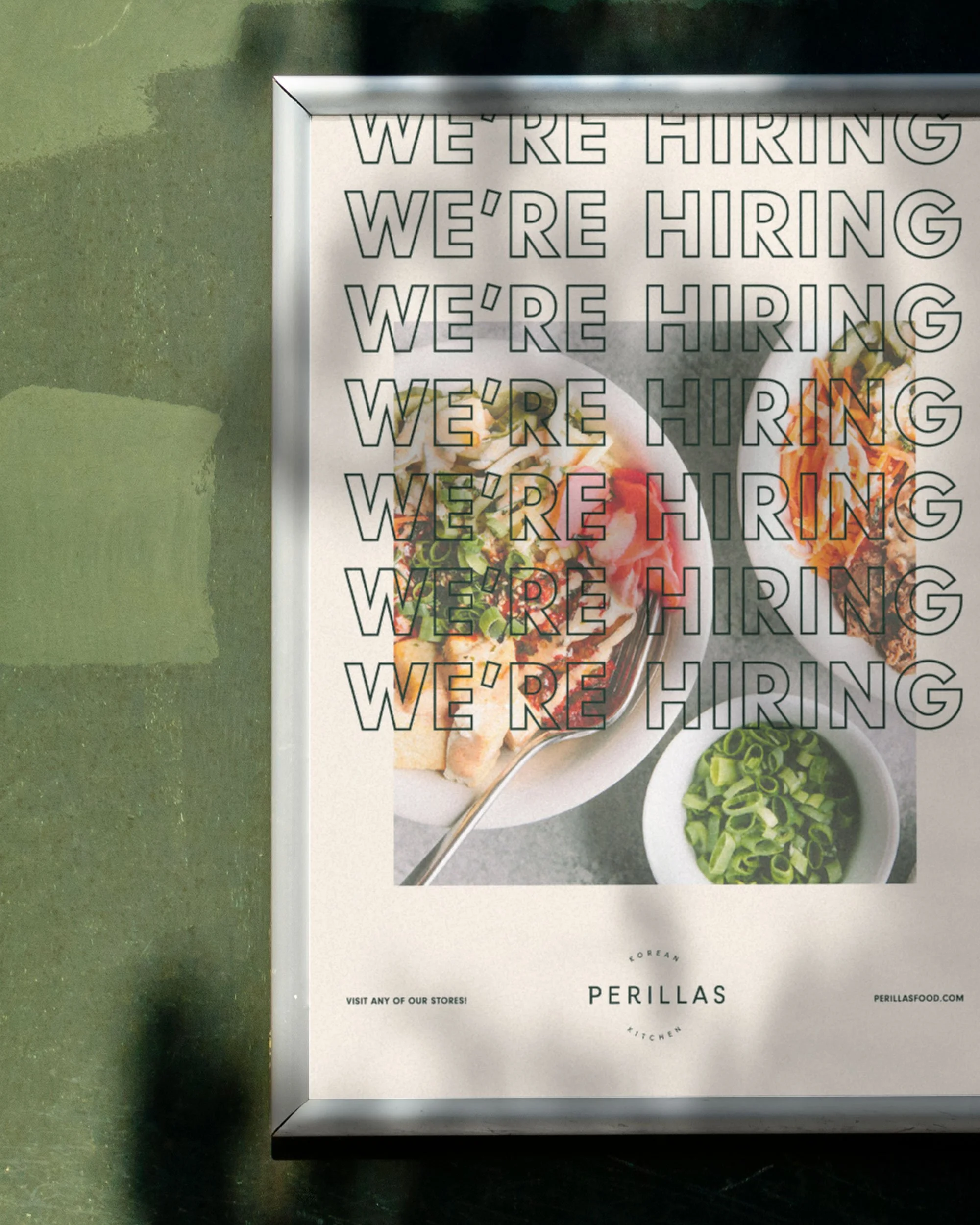
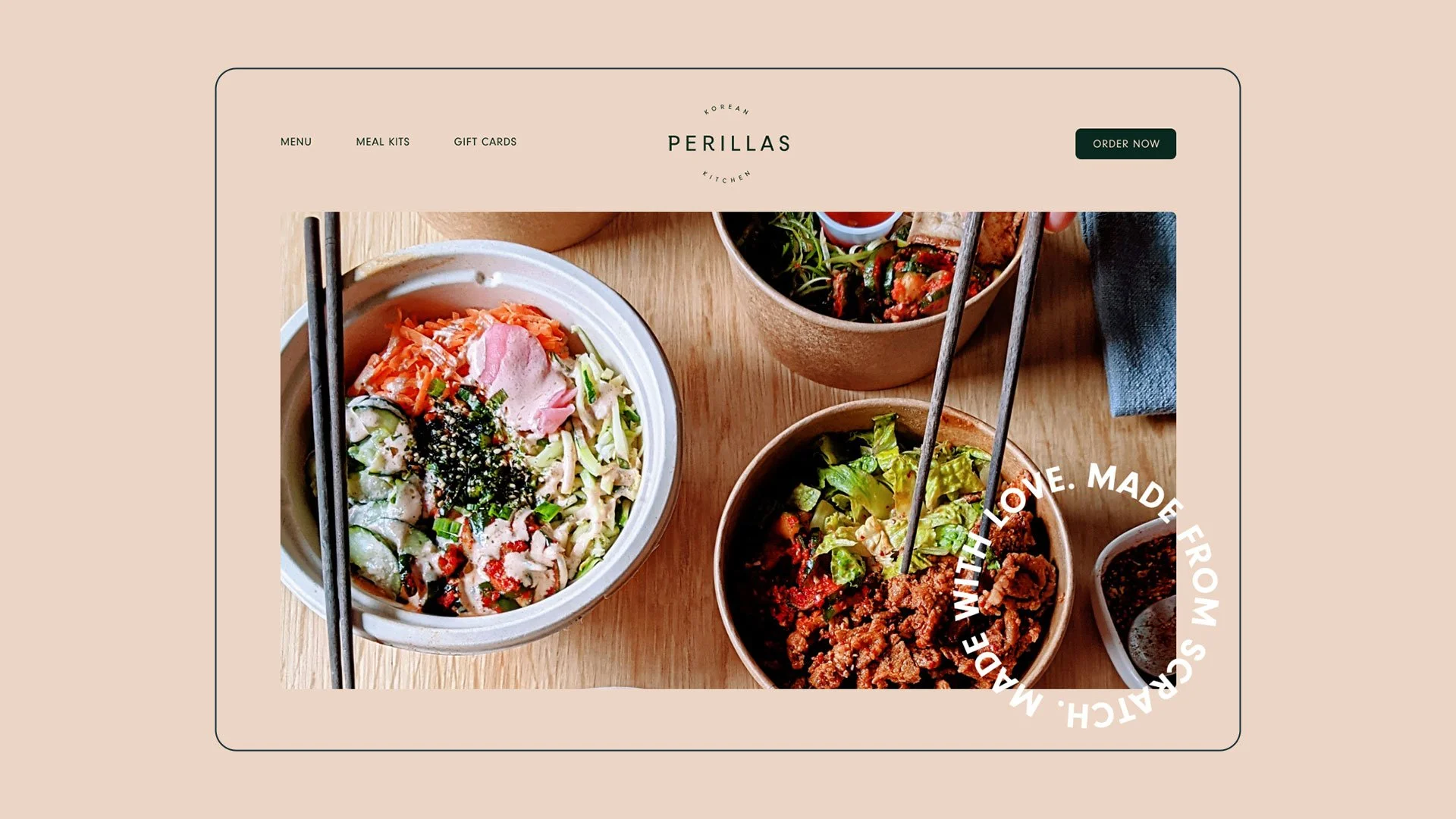
The “Simplified Kitchen” direction strips things back to what matters—a tonal palette, geometric sans type, and line icons that let the food lead. Photography brings warmth and freshness forward, with food acting as the primary source of color.
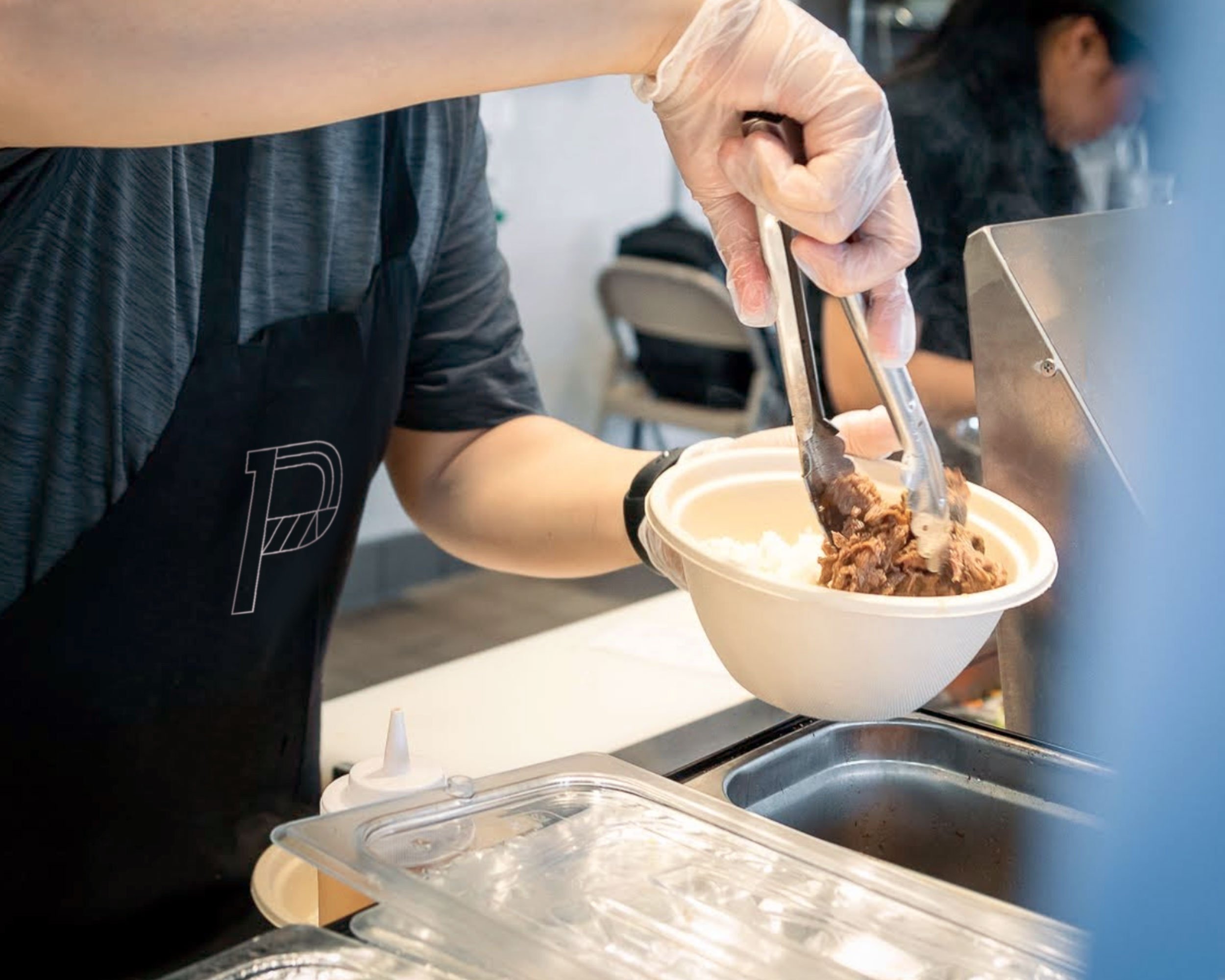
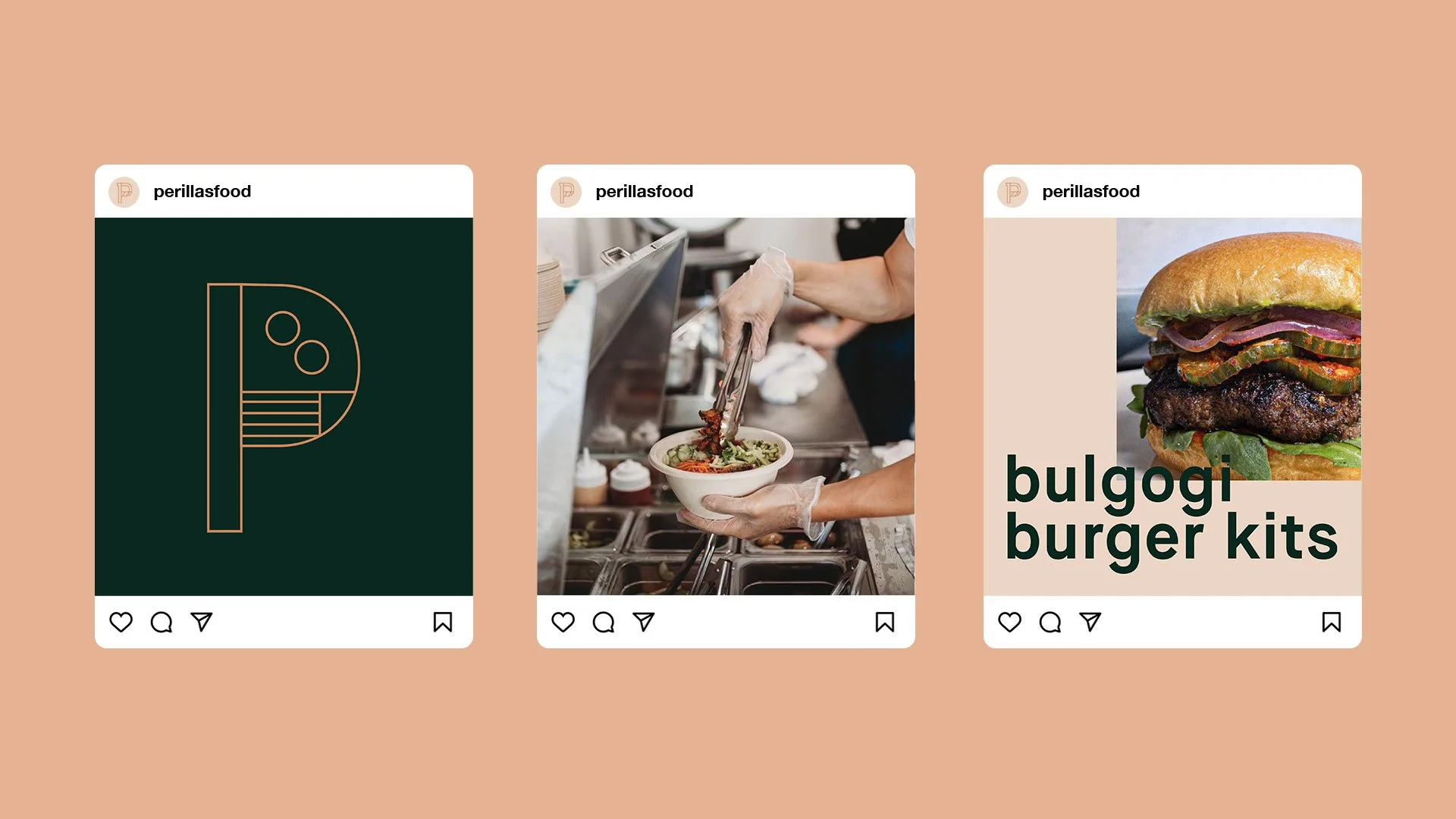
A backlit sans-serif wordmark and minimal window decals keep the storefront clear and utilitarian, easy to notice, easy to navigate. The simplicity supports seamless ordering while keeping the focus on the food and the people behind it.
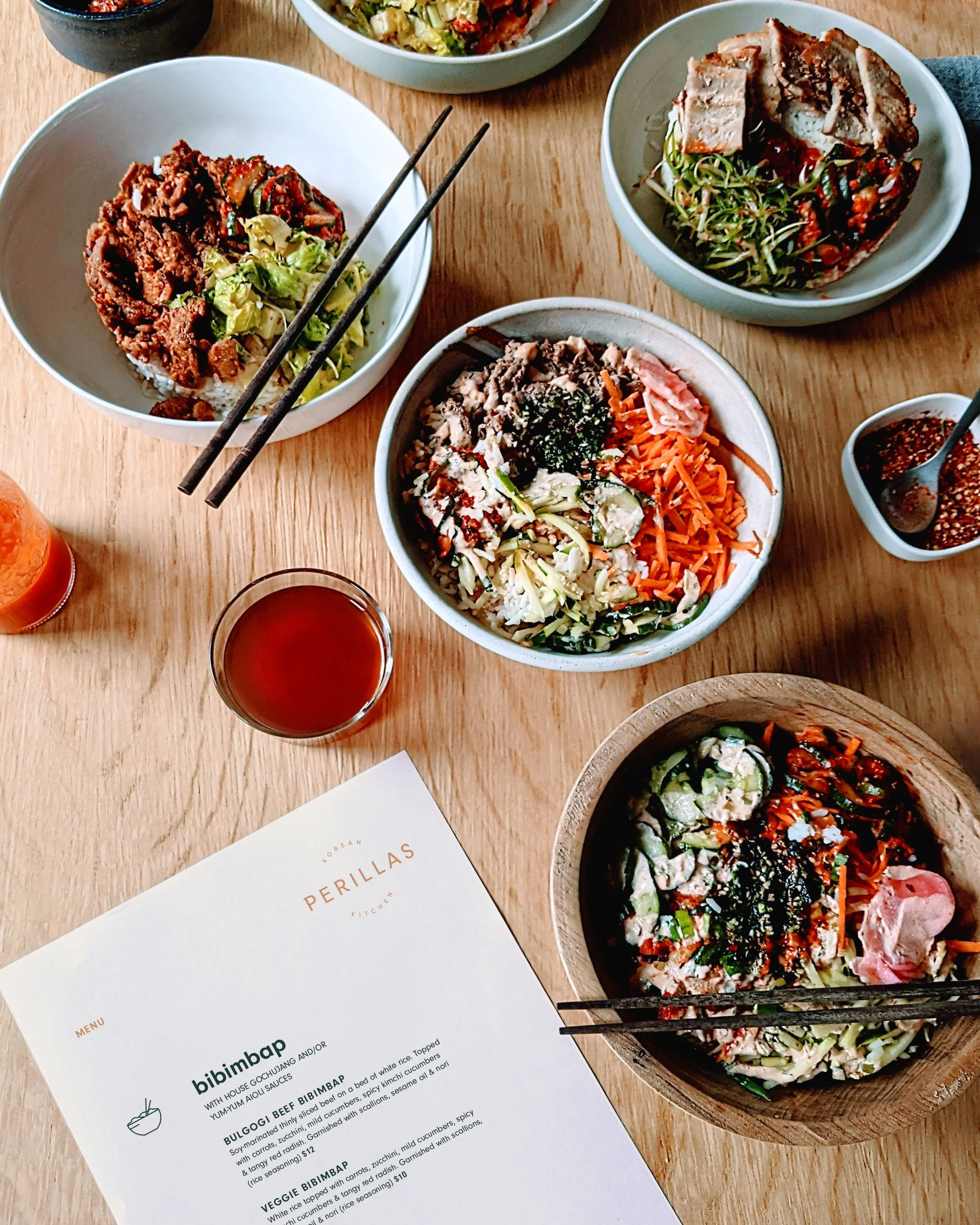
The goal was to get out of the way, so the food and experience could lead.
Keep exploring
Big Step Coffee
Branding + Packaging
Freelance for Life
Branding
Montavilla Farmers Market
Branding + Signage