
ClIENT: Pickathon
Design Direction / Branding
ROLE: Studio Mega
Victoria Wells
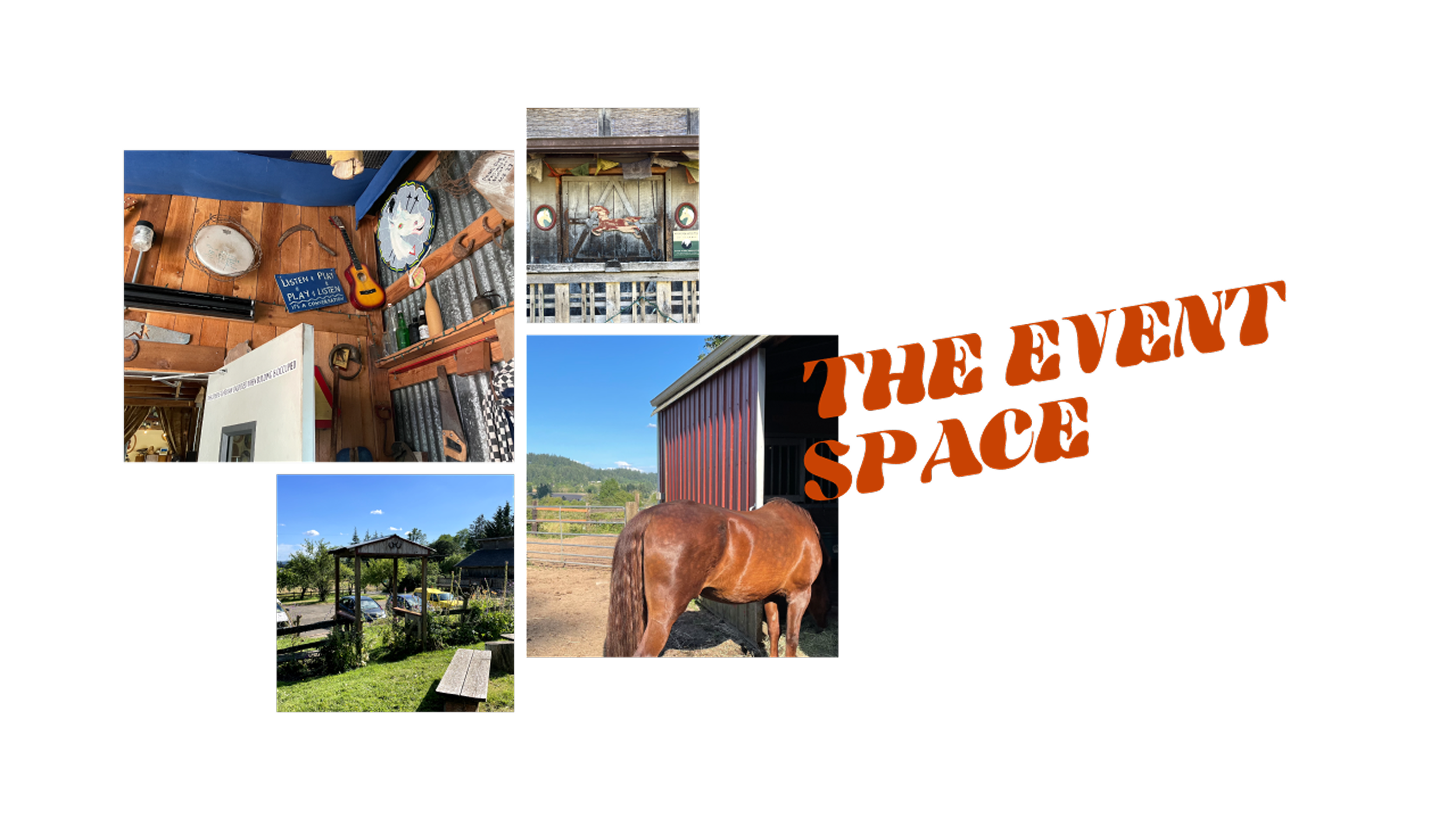
TEAM: Pickathon is a Portland music festival known for its unique rural location and creative collaborations with designers, artists, indie musicians, and experimentalists alike. For one of its entry experiences, The Orchard, the festival wanted a branded space that could set the tone for attendees.
The visual system blends psychedelic and Western motifs, providing a flexible framework for mixed-media artists and wayfinding elements throughout the space during the event. It was designed to be both immersive and adaptable, reflecting the festival’s spirit of creativity and experimentation.
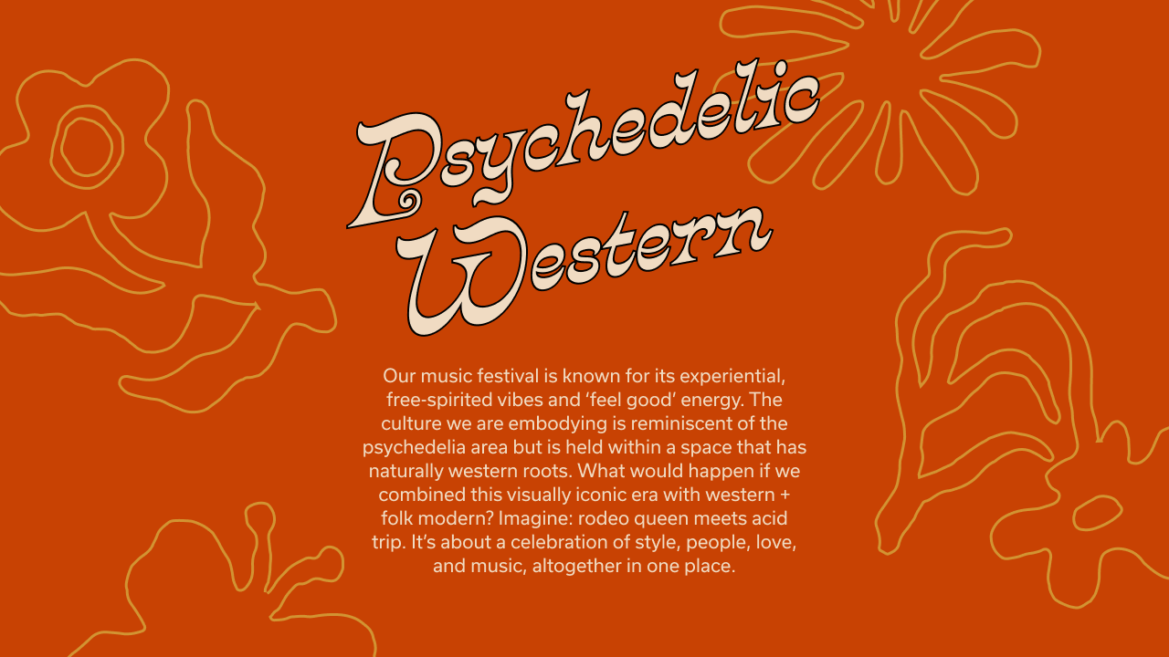
The visuals adapt to the lighting and energy of the space, moving between distinct “day” and “night” modes. Day mode channels 60s/70s folksy graphics and type, reflective light, and a warm palette, while night mode shifts into psychedelic, high-energy territory with cooler tones—melting disco balls, tachyon imagery, and trippy folklore.
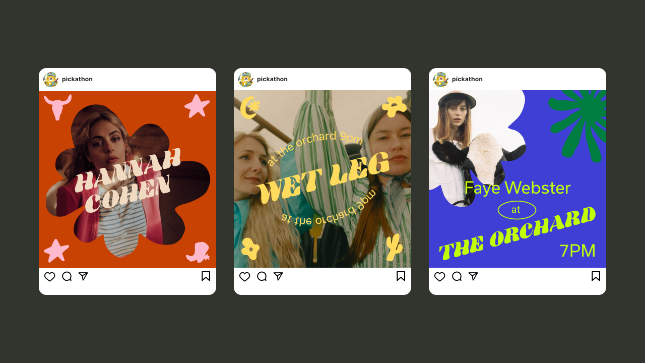
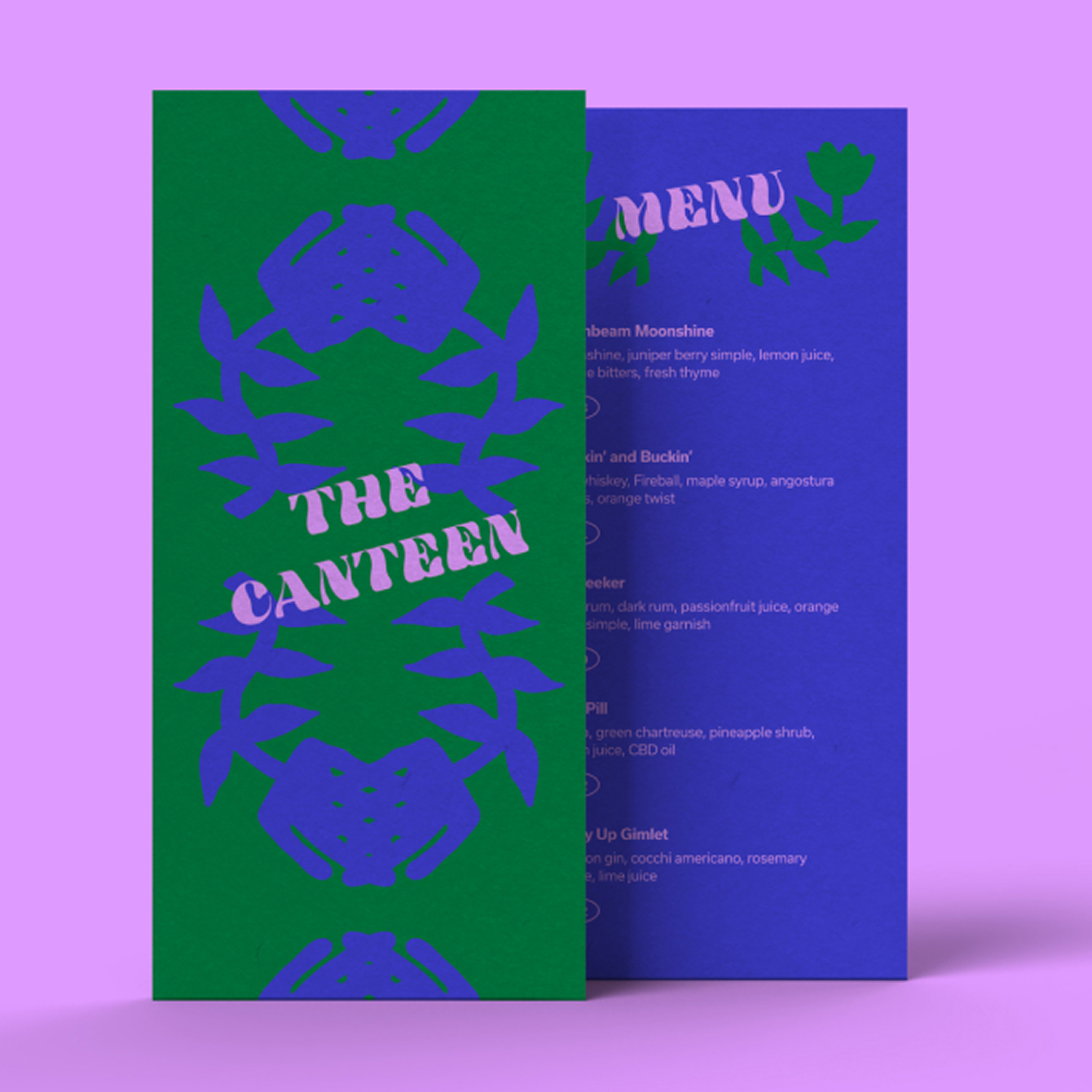

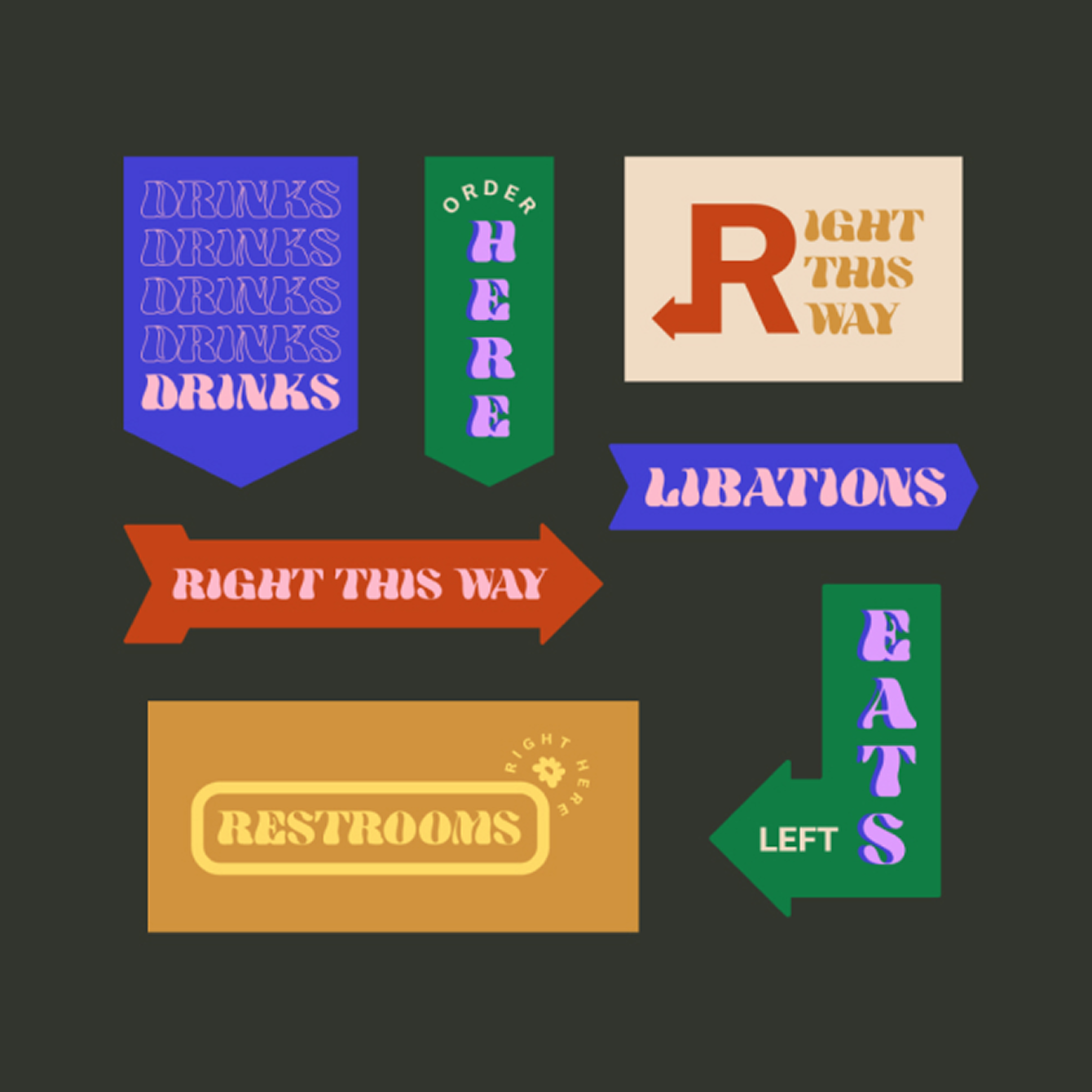
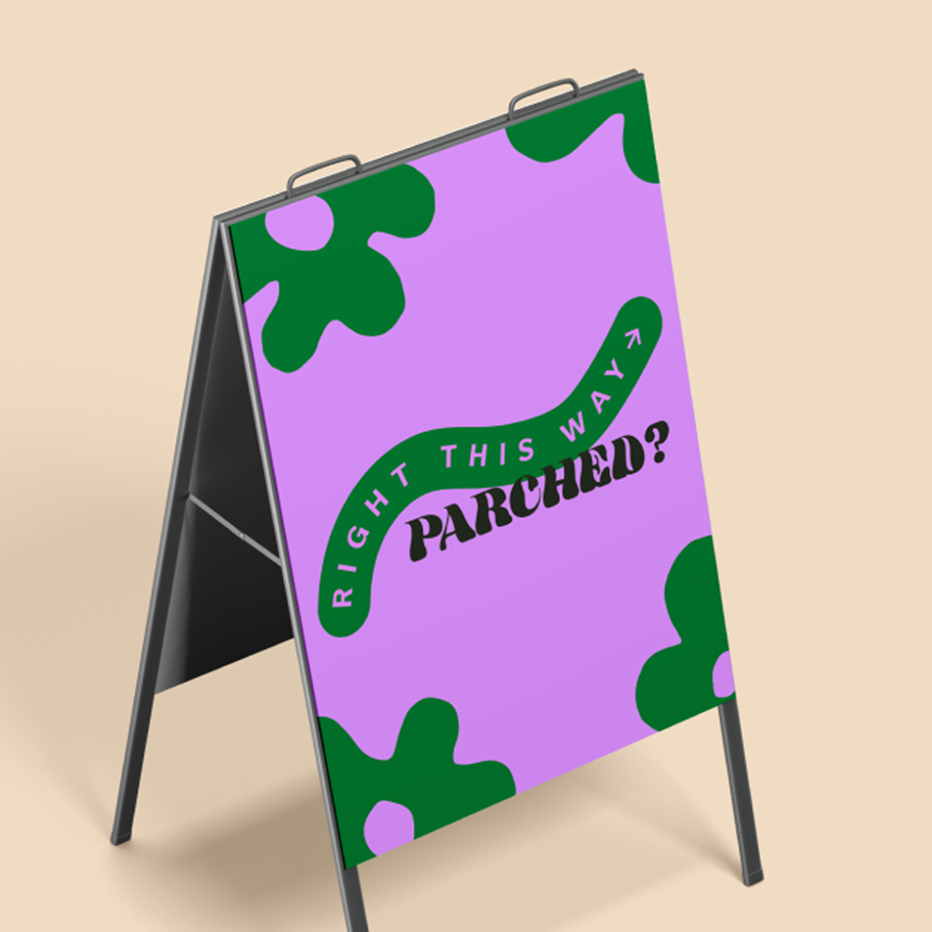
Wayfinding elements and social graphics were designed to connect with festival-goers, guiding them through the space and sparking curiosity. Shapes, colors, and type textures formed a playful, flexible palette that artists could reference and riff on throughout the space.
Keep exploring
Joker Bob LP
Packaging
Freelance for Life
Branding

Eat Real
Branding + Campaigns